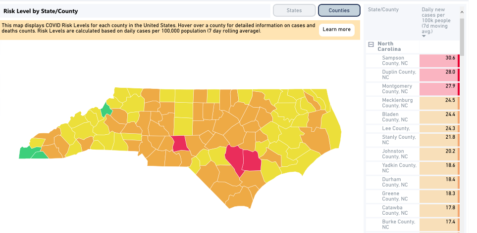
HARVARD STUDY: Stanly averages almost 22 coronavirus cases per 100,000 people
Published 2:04 pm Thursday, July 2, 2020

- Stanly is averaging almost 22 cases per 100,000 people over the past seven days, according to a Harvard University interactive map, which is tracking COVID-19 risk levels for each state and county in the country. The county ranks seventh out of the 100 counties in terms of risk.
|
Getting your Trinity Audio player ready...
|
As coronavirus cases in North Carolina continue to increase, new data show where in the state the risk is most pronounced.
Harvard University experts released a tool Wednesday that charts coronavirus risks by state and county according to the number of new cases per 100,000 people over the last seven days — a metric they say is better suited to comparing areas with widely varying population sizes.
The map categorizes the risk levels by color (green, yellow, orange and red) from least severe to most severe. The levels are measured by the number of new daily cases per 100,000 people.
According to the data, which is updated daily, Stanly County was orange and averaging 21.8 cases per 100,000 people per day as of Thursday. North Carolina is also orange, averaging 13.5 cases per 100,000 people, which ranks the state 14th in the nation in terms of risk.
As of Thursday, Stanly had 420 confirmed cases and five deaths. There are at least 68,142 known cases in North Carolina along with 912 people hospitalized and 1,391 deaths. Nine percent of all tests in Stanly are positive, slightly higher than the state’s 8 percent.
Orange represents an accelerated spread of the virus (10 to 24 cases per 100,000 people) where, according to Harvard, stay-at-home orders and/or rigorous test and trace program are advised.
As of Thursday, three counties in the state are red (25 or more cases), including Montgomery County, with 27.9 cases per 100,000 people. Mecklenburg, which sits at 24.5 cases, is close to joining the three states. The two worst counties are Sampson, which is averaging 30.6 cases, and Duplin, which is averaging 28.0 cases.
And to show how fluid things can change, Stanly was also red on Wednesday. The county currently ranks seventh out of 100 counties in the state in terms of risk.
Cabarrus, Rowan, Union, Anson and Davidson counties are also orange though their average daily cases have been far less than those in Stanly. Over the past seven days, Rowan has averaged 15.9 cases per 100,000 people, Davidson has averaged 15.1, Cabarrus has averaged 14.7, Union has averaged 13.3 and Anson has averaged 11.7.
Stanly’s rate is higher than practically every neighboring county, including Cabarrus (14.7), Rowan (15.9), Union (13.3), Anson (11.7) and Davidson (15.1). It’s also higher than the four peer counties it’s commonly compared with — Haywood (4.1) Carteret (5.6), Moore (11.2) and Chatham (12.7).
The interactive map uses four colors to illustrate risk levels in every county: green, yellow, orange and red.
- Green: Less than one case per 100,000 people and containment is on track. Use contact tracing and testing to monitor.
- Yellow: One to nine cases per 100,000 people, indicating community spread and the need for rigorous testing and tracing.
- Orange: 10 to 24 cases per 100,000 people, showing “accelerated spread” and stay-at-home orders are advised.
- Red: 25 or more cases per 100,000 people, meaning the county is at a “tipping point” and stay-at-home orders are necessary.
The Covid Risk Level Map was created by a team of research, policy and public health experts convened by Harvard’s Global Health Institute and Edmond J. Safra Center for Ethics.


